Application appearance
In the Action Plan application we can distinguish 2 types of views, which on surface may look similar, but they differ in few important places. These views are: the main view and the view of a specific action plan.
Main view
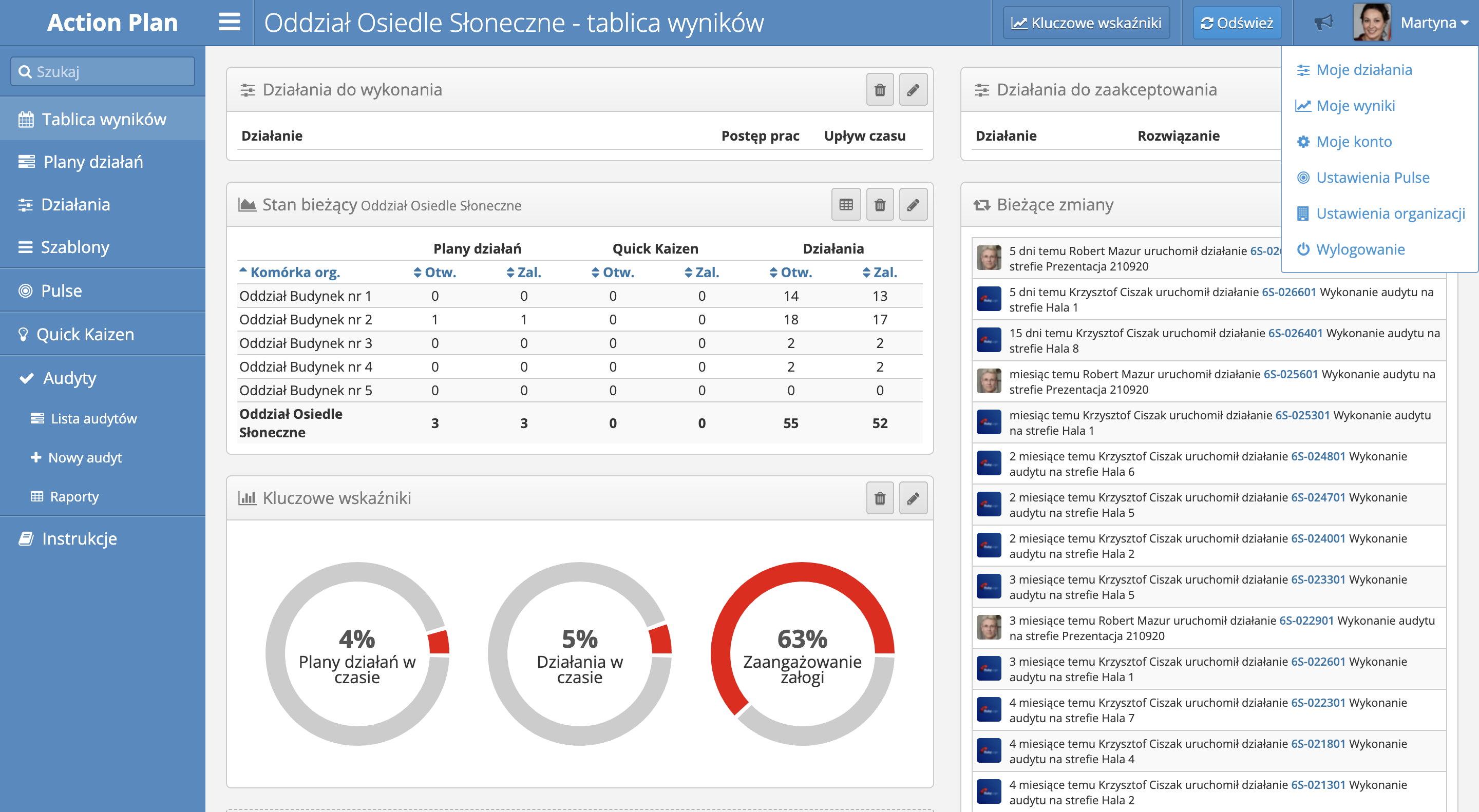
The default view of most screens in the system, with the example of the Dashboard screen below.

In the view we can distinguish following elements:
- Navigation Bar with the application name, the title of currently presented screen, context sensitive buttons and the name of the current user, serving as a link to the User Menu.
- User Menu is available after hovering over the username and contains following options:
- My activities - link to the list of activities assigned to the current user as activities to complete or accept,
- My results - link to the screen showcasing percentage of activities and plans in time (the ones, that are currently being realized, and are not yet past their expiration date), among other things,
- My Account - link to user account settings,
- Pulse Settings - link to the settings of the Pulse application concerning, among other things, hours, in which the push notification will be sent to the mobile phone,
- Organization settings - link availabe only for designated people, leading to the screen with global client organization settings,
- Log out - link to logging out from application
Always log out of the application after finishing your work in order to protect your account and the data gathered in the system
- Main Menu - situated in the left side of the screen, contains links leading to each part of the application. This menu can have different formats, depending on the licence tier, and user permissions.
- Workspace - the larges part of the screen, reaching the down right corner of it, showing the currently chosen part of the application.
- Page footer - visible from the beggining, or after scrolling down, small, grey area with information about current licence.
Action plan view
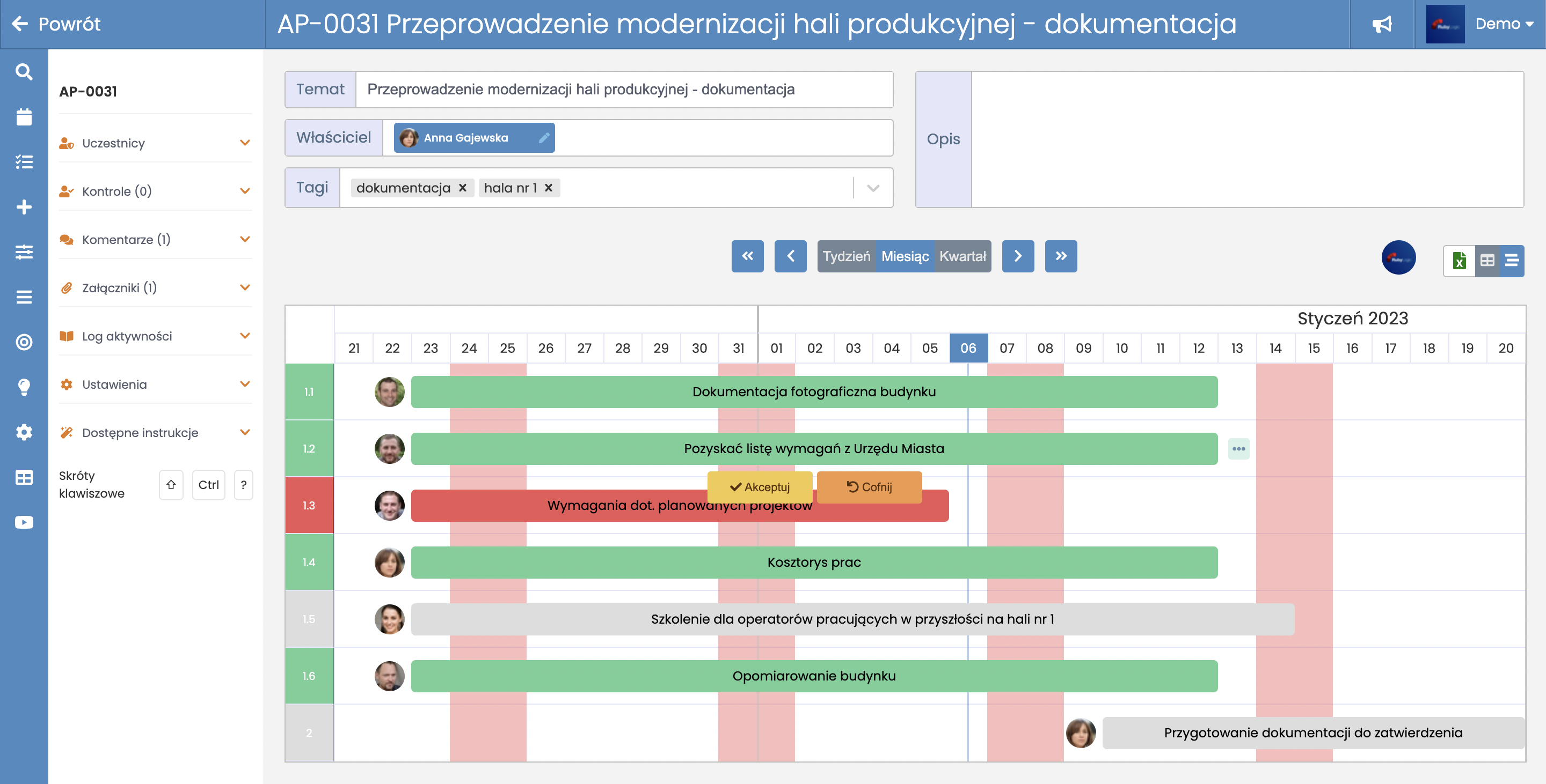
After opening action plan details the apperance of the application changes slightly. The view of a single action plan has been optimized for the faster acces to the information, ability to change between table view and Gantt view, and general improvement of work with each plan.

Main elements, that look different in the action plan view, are: Główne elementy, które wyglądają inaczej na widoku planu działań to:
- Adding the "Back" button which suggests, that the user is current;y in a special part of the application.
- Minimized main menu which, during work with a specific action plan, is less important.
- Additional left panel facilitating access to resources related to the plan, e.g. attachments and comments.
TODO: Ekran planu działań oraz praca z planem zostaną opisane w ramach osobnej instrukcji.